Introduction
Text shadows add depth and emphasis to typography, giving your design a polished, dynamic look. Although Tailwind CSS (up to version 4) doesn’t ship with built‑in text‑shadow utilities, the flexibility of its Just‑in‑Time (JIT) mode means you can define your own text shadows directly in your HTML. This approach lets you experiment rapidly without the need for plugins or extensive configuration changes.
How Arbitrary Values Work in JIT Mode
Tailwind’s JIT engine scans your source files and generates styles based on the classes it finds. By using the square-bracket syntax, you can insert any valid CSS declaration as an arbitrary value. For instance:
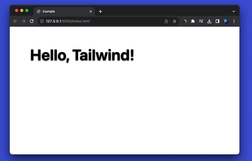
<p class="[text-shadow:_0_2px_4px_rgba(0,0,0,0.5)] text-2xl font-bold">
  Hello, Tailwind!
</p>
In the example above, Tailwind outputs the CSS:
text-shadow: 0 2px 4px rgba(0, 0, 0, 0.5);No additional configuration is necessary—just ensure you’re running in JIT mode (which is the default in recent versions).
Benefits of Using Arbitrary Values for Text Shadows
- Simplicity: Write a custom utility on the fly without modifying your Tailwind config.
- Flexibility: Precisely control every aspect of the shadow—offsets, blur, color, and opacity.
- Rapid Prototyping: Quickly test and iterate different shadow styles directly in your HTML.
- No Extra Bloat: Avoid additional plugins or complex configuration, keeping your CSS lean.
Examples
Below are several practical examples that demonstrate how to create custom text shadows using arbitrary values. We’ll look at basic text shadows, custom shadow colors, custom shadow sizes, and even responsive variations.
Basic Text Shadow
A simple text shadow with a subtle blur:
<!DOCTYPE html>
<html lang="en">

<head>
    <meta charset="UTF-8">
    <meta name="viewport" content="width=device-width, initial-scale=1.0">
    <script src="https://unpkg.com/@tailwindcss/browser@4"></script>
    <title>Example</title>
</head>

<body>
    <div class="m-20">
        <p class="[text-shadow:_0_2px_4px_rgba(0,0,0,0.5)] text-6xl font-bold">
            Hello, Tailwind!
        </p>
    </div>
</body>

</html>
This applies a shadow with no horizontal offset, a 2px vertical offset, and a 4px blur radius in semi‑transparent black:
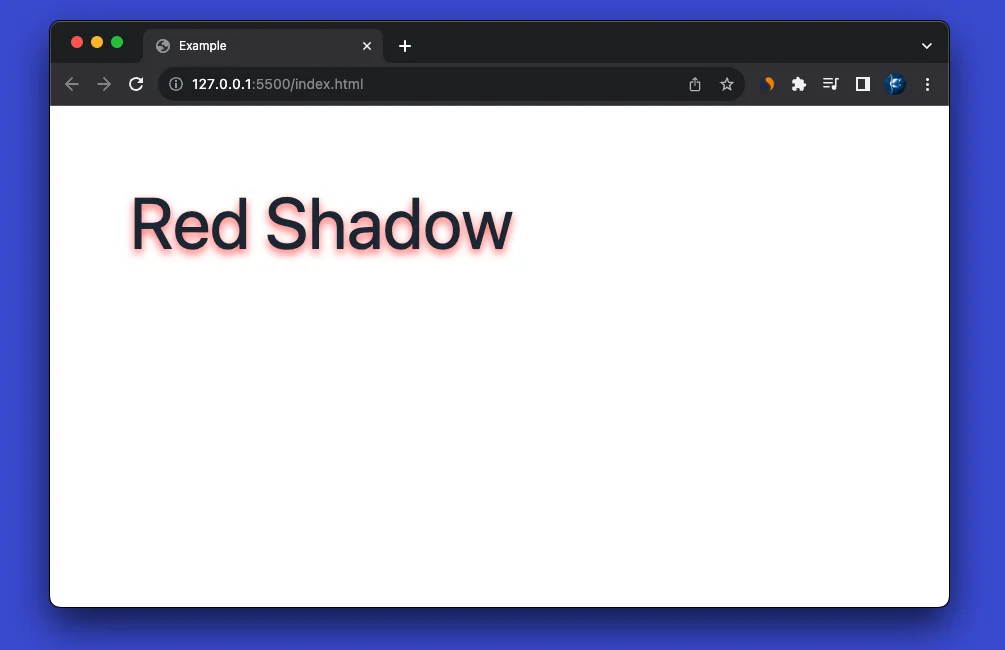
Custom Shadow Color
You can easily adjust the color of the shadow by using an arbitrary value with your preferred color. For example, a red text shadow might look like this:
<body>
    <div class="m-20">
        <p class="[text-shadow:_0_4px_8px_rgba(255,0,0,0.6)] text-7xl text-gray-800">
            Red Shadow
        </p>
    </div>
</body>
Here, the shadow color is set to a semi‑transparent red (60% opacity), giving the text an eye-catching glow.
Custom Shadow Size
Customizing the shadow’s size involves tweaking the offsets and blur radius. For a larger, more dramatic shadow, try:
<body>
    <div class="m-20">
        <p class="[text-shadow:_2px_4px_8px_rgba(0,0,0,0.7)] text-4xl font-extrabold">
            Big and Bold Shadow
        </p>
    </div>
</body>
In this example, the shadow is shifted 2px to the right and 4px down, with an 8px blur and a darker opacity (70%). The result is a pronounced shadow that makes the text pop.

Responsive Text Shadow
Arbitrary values work seamlessly with Tailwind’s responsive utilities. You can specify different text shadow values for various breakpoints. For instance:
<body>
    <div class="m-20">
        <p class="text-xl font-semibold
          [text-shadow:_0_1px_2px_rgba(0,0,0,0.4)]
          md:[text-shadow:_0_3px_6px_rgba(0,0,0,0.6)]
          lg:[text-shadow:_0_4px_8px_rgba(0,0,0,0.8)]">
            Responsive Text Shadow
        </p>
    </div>
</body>- Mobile: A light shadow with a 1px vertical offset and a 2px blur.
- Medium Devices: A stronger shadow with a 3px vertical offset and a 6px blur.
- Large Devices: An even more pronounced shadow with a 4px vertical offset and an 8px blur.
This approach ensures your text looks great on any device, with the shadow effect adapting as needed.
When to Use This Approach
Using arbitrary values for text shadows is particularly advantageous when:
- You need a one-off styling effect without adding new utilities to your configuration.
- You’re in the early stages of design and experimenting with different looks.
- You prefer to keep your Tailwind setup minimal while retaining complete control over styling details.
If you find yourself reusing the same text-shadow values repeatedly, consider abstracting them into custom utilities or a plugin for consistency and easier maintenance.
Conclusion
Tailwind CSS’s JIT mode, with its support for arbitrary values, provides an elegant solution for adding text shadows without relying on native utilities or third‑party plugins. By writing custom CSS declarations directly in your class names, you can achieve complex and unique text-shadow effects that enhance the depth and dynamism of your typography.
Whether you’re tweaking shadow colors, adjusting sizes, or implementing responsive designs, the flexibility of JIT mode lets you experiment and refine your style effortlessly. Embrace this approach to give your text the dimensionality it deserves, and elevate your web design with precision and creativity.