In Tailwind CSS, you can style a <select> element in a nice way by making use of the official plugin called @tailwindcss/forms. To install the plugin, run the following command in the root directory of your project:
npm i @tailwindcss/forms -DNext, open your tailwind.config.js file, and then require the plugin in the plugins section:
plugins: [
    // add this line
    require('@tailwindcss/forms'),
],
Now we’re ready to go. However, if you’re still learning Tailwind CSS and don’t want to set up things, you can use the CDN version:
<script src="https://cdn.tailwindcss.com?plugins=forms"></script>Example
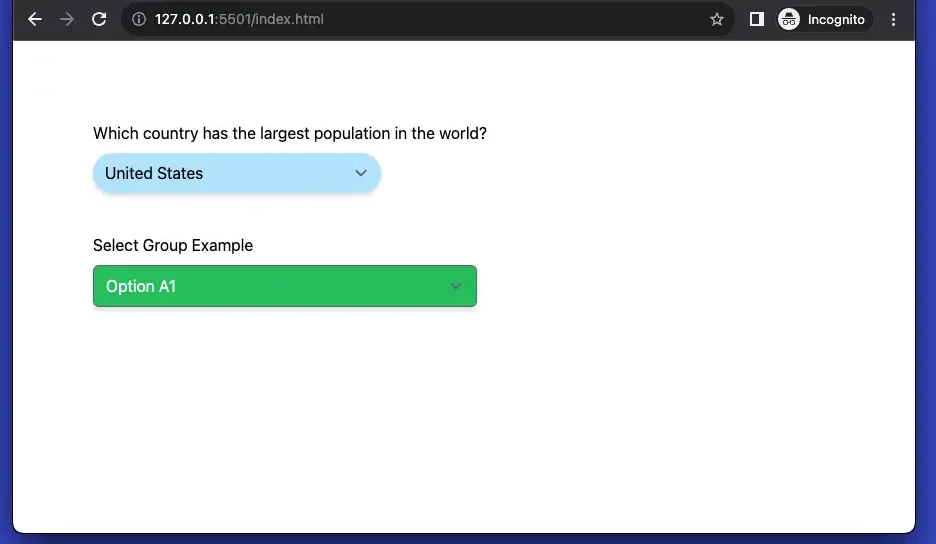
Let’s take a look at what we’re going to make:
And here’s the code:
<body class="p-20">
    <form class="space-y-10">
        <div class="flex flex-col space-y-2">
            <label for="country">Which country has the largest population in the world?</label>
            <select name="country"
                class="border-0 cursor-pointer rounded-full drop-shadow-md bg-sky-200 w-72 duration-300 hover:bg-sky-400 focus:bg-amber-300">
                <option>United States</option>
                <option>India</option>
                <option>Brazil</option>
                <option>Indonesia</option>
                <option>Japan</option>
                <option>China</option>
            </select>
        </div>

        <div class="flex flex-col space-y-2">
            <label for="something">Select Group Example</label>
            <select name="something"
                class="w-96 rounded-md drop-shadow-md bg-green-500 duration-300 hover:bg-green-600 focus:bg-green-600 focus:ring-0 text-white">
                <optgroup label="Group A">
                    <option>Option A1</option>
                    <option>Option A2</option>
                    <option>Option A3</option>
                    <option>Option A4</option>
                </optgroup>
                <optgroup label="Group B">
                    <option>Option B1</option>
                    <option>Option B2</option>
                    <option>Option B3</option>
                    <option>Option B4</option>
                </optgroup>
                <optgroup label="Group C">
                    <option>Option C1</option>
                    <option>Option C2</option>
                    <option>Option C3</option>
                    <option>Option C4</option>
                </optgroup>
            </select>
        </div>
    </form>
</body>
By using the @tailwindcss/forms plugin, all of the basic form elements you use will now have some simple default styles that are easy to override with utilities.